Using the Photoshop Gradient Map Adjustment for High-Contrast Black & Whites
As I discussed in the post about converting to black and white using a channel mixer, there are many ways to create black and white images in Photoshop. One of these ways is to use a Gradient Map adjustment layer, which also happens to give us a great way to increase and fine-tune the contrast and create stunning high-contrast black and whites.
The best part is that all you need is the gradient map adjustment for the full effect, so this technique is as simple as it gets.
Before / After:
Gradient Map Adjustment
First, add a Gradient Map adjustment layer and keep the default black and white gradient as the selected preset. This will effectively convert your image to black and white because the tones will all be mapped against the black to white scale, depending on the underlining tone. The only problem is that our image still looks a bit flat and there’s no added contrast just yet:

Now, click on the gradient preset to open up the Gradient Editor. Just add two extra color stops, a black one towards the black side and a white one towards the white side:

These extra color stops modify your black and white points. Just adjust them until you get something that looks just right for your particular image. Here I have my extra black point at 13% and my extra white point at 78%.
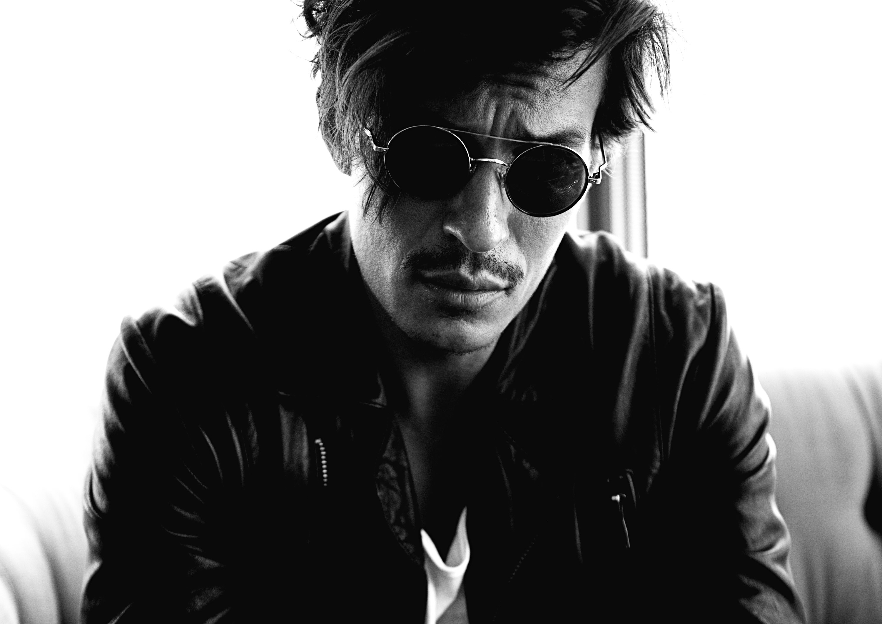
And that’s it, now you have a black and white image that really pops, thanks to the added contrast! This technique works especially well when your image has a lot of tonal variations to start with. Here for example, the white background and t-shirt contrast very well with the dark hair, black sunglasses and black jacket.
Final Touches
The image is great as it is, but I still finished it up with a little bit of extra tweaks to the tonality and sharpening:
Levels Adjustment
I added a levels adjustment layer and set the black point to a value of 10 as well as the black input to a value of 10. That changes the black point even further, but tones down the black by introducing a little bit of gray into it. It gives the image a bit of a vintage effect, and some images will benefit by increasing these values even more.

Sharpening
Finally, I added some sharpening to the image as a whole. For this, I used a high pass filter, and you can learn the technique in this guide.

Still Want Some Color?
You can also use a similar technique for color images by using the same Gradient Map settings, but by setting the whole adjustment layer to a different blend mode. Something like Multiply, Soft Light or Luminosity should give you good results. Of course, you’ll often also want to turn down the opacity of the gradient map adjustment too, just to tapper down the effect.
Here, for example, is what we get when we keep all the same preset settings, but change the gradient map layer to a blend mode of Soft Light with its opacity set to 80%:

🌄 Image info:
- Camera: Nikon D800
- Focal length: 42mm
- Shutter speed: 1/125s
- Aperture: f/2.8
- ISO: 320