AdobeRGB vs sRGB, Which Color Space is Better for Photography?
You’ve probably noticed when you bring your photos in Photoshop from Lightroom, Camera Raw or Capture One that you get to choose the color space to edit the photograph in. The two main and most popular options being AdobeRGB and sRGB. Or maybe you’ve noticed that you get that choice when it comes to exporting for the web.
In this short post I’ll try to answer which color space you should be using for getting the best results possible.
TL;DR;
My recommendation is to make all your edits using AbodeRGB or ProPhoto RGB, and then convert to sRGB at the end when exporting for the web. This way you’ll retain a greater range of color information in your edits. And then by having your edits in AdobeRGB or ProPhoto RGB, you’ll always retain the option to print your work later on too.
Just don’t forget to convert to sRGB when exporting for the web. The web only understands sRGB. Most of the time though the option to convert to sRGB will be active by default when exporting, so you won’t even have to think about it.
Shooting RAW
When shooting RAW, which I highly recommend, you only record the raw image data that the camera sensor receives, so no color space is embedded at this point. You therefore get to chose the color space to edit or export your images in in your RAW editor of choice (e.g.: Lightroom, Camera Raw or Capture One).
If you’re shooting in jpeg only, or JPEG + RAW, your camera will give you a choice of color space for the JPEGs. I’d recommend using AdobeRGB there. But again, if you’re shooting RAW only, then you don’t need to worry about any of the color space settings in your camera, they won’t have any effect.
Here’s how setting the color space looks like in the different RAW editors:
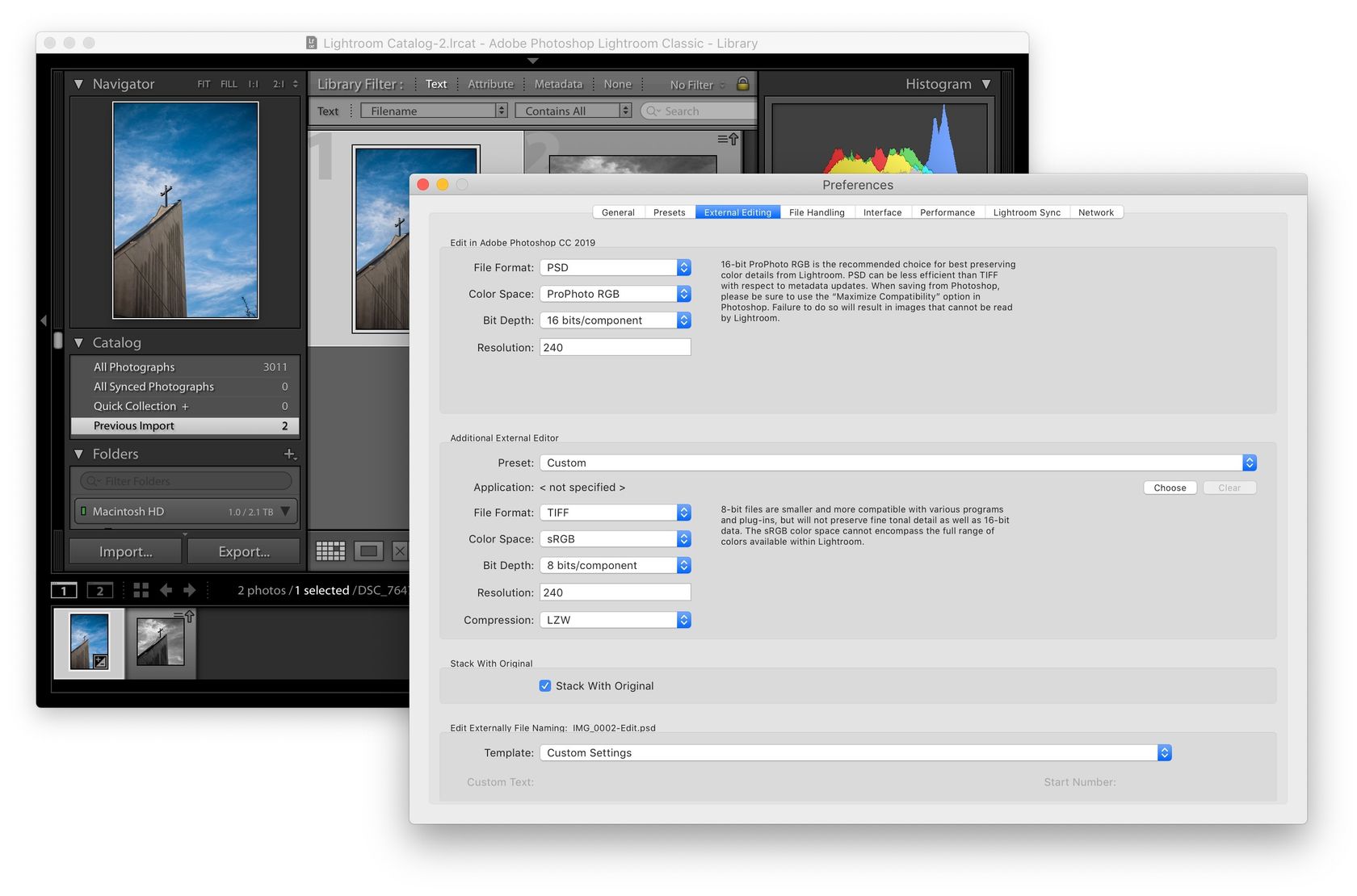
Lightroom
In Lightroom Classic, go to the the Lightroom Classic menu and then Preferences. In the window that pops-out, go to the External Editing tab and there you’ll see the options to choose your color space for editing and exporting:

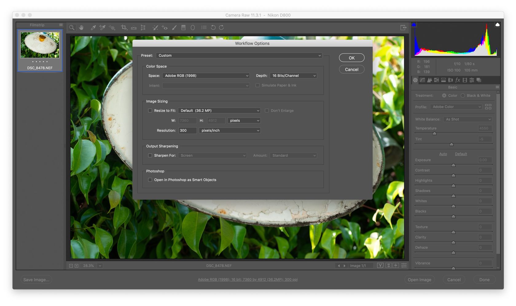
Camera Raw
For Camera Raw, you’ll see some text at the bottom of the main window with your current color space. You can click that text to bring up a dialog with color space options:

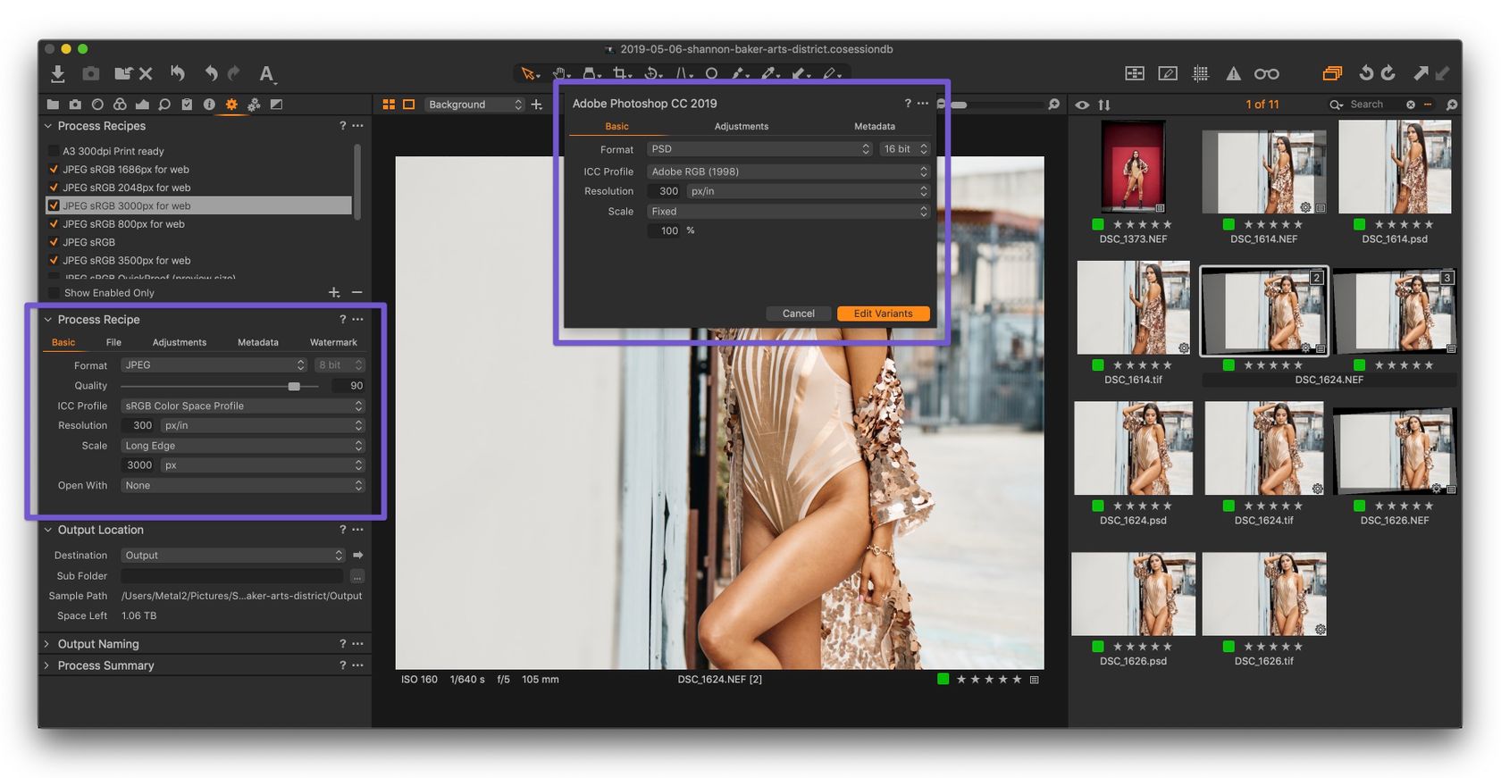
Capture One
In Capture One, when editing to Photoshop, a dialog will appear to allow you to choose your color space. When exporting, you’ll also have the option to choose your desired color space profile:

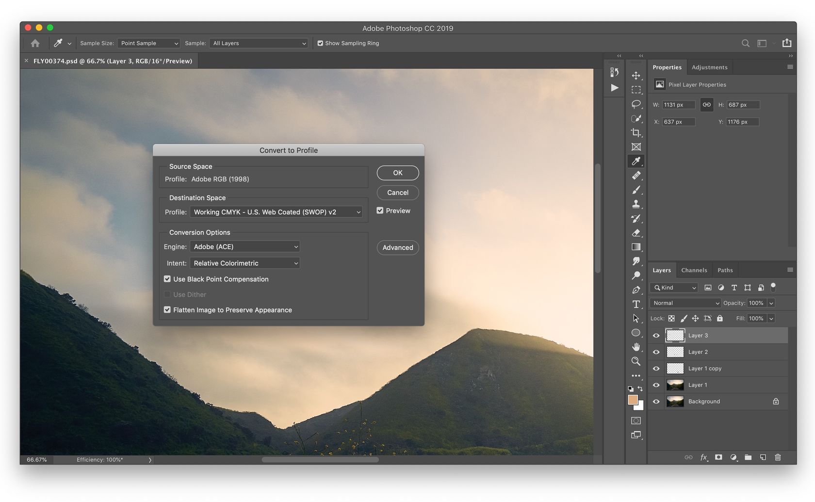
Photoshop
And then finally, if you’re in Photoshop and not sure in which color space you’re working with, you can go to the Edit menu and then to Convert to profile… and there you’ll see in which color space your image is currently being edited in:

Color Spaces
Color Space gets really complicated really fast. I’ll keep it simple by saying that color space is the system by which colors are organized on a particular device or system. There are many color spaces out there, but for the purposes of photography the most often used ones are AdobeRGB, ProPhoto RGB and sRGB, which are all based on the RGB color model (red, green and blue).
Out of those 3 (AdobeRGB, ProPhoto RGB and sRGB), sRGB contains the smallest color range and is the most constrained in terms of colors. It’s the color space that’s used on the web and most devices can only reproduce the colors from the sRGB color space. That’s the reason why you’ll want to convert your finished edits to sRGB when exporting for the web.
As for AdobeRGB and ProPhoto RGB, both which were developed especially for photography, they contain a color range that’s much wider, especially for saturated greens and blues, which are common color tones in photographs. ProPhoto RGB contains a wider color range capability than AdobeRGB, but almost to the point of being overkill because both monitors and printers can seldom reproduce all the colors from ProPhoto RGB anyway. You’d need ProPhoto RGB only for certain edge cases like printing on using specific printers/papers that can work well with the wider range of colors. Still though, you definitely can’t go wrong with editing using ProPhoto RGB, because it has the widest color range.
AdobeRGB, for its part, contains a wider range of colors that most devices can’t reproduce, but that encompasses all the colors from the CYMK color space used for printing. That’s one of the reason why keeping your edits in AdobeRGB makes sense; it allows to print your photographs with the most amount of color information. So you won’t see the colors in all their glory on your computer screen, but they’ll still be there if you need them for printing and such. And yet still, if your budget eventually allows, some specialized monitors are capable of reproducing the colors from the AdobeRGB color space, so you may be lucky one day and own one such device.
When sRGB Makes Sense for Edits
I’d say that the only time where editing in the sRGB color space could make sense is if you’re sure that the final output of your work will always be on a screen and never printed. Then, if that’s the case, you could just stay in sRGB for the whole process.
Don’t forget to convert your final exports to sRGB however, because again sRGB is the default and only color space on the web and AdobeRGB images would look duller on the web and on non-AdobeRGB capable software.