How to Create a Duotone Effect in Adobe Photoshop
A duotone is a color effect where a color overlay is added to an image, but with different colors depending on the underlining level of luminosity of the image. That means one color is applied in the shadows and a different one is applied to the highlights, and varying degrees of the two for tones in-between.
The effect has been used for a long time, but came back in the spotlight in recent years from its use by major brands like Spotify and Apple. It can add a very nice and colorful effect to an image and make things look really vibrant.
It just so happens that it's very easy to create such effect in Photoshop using nothing but a simple Gradient Map adjustment layer and a careful selection of colors. The effect works better for some images than others. It tends to work well for image that are really contrasty to start with and image that have a good amount of both shadows and highlights.
Let's see how it's done!
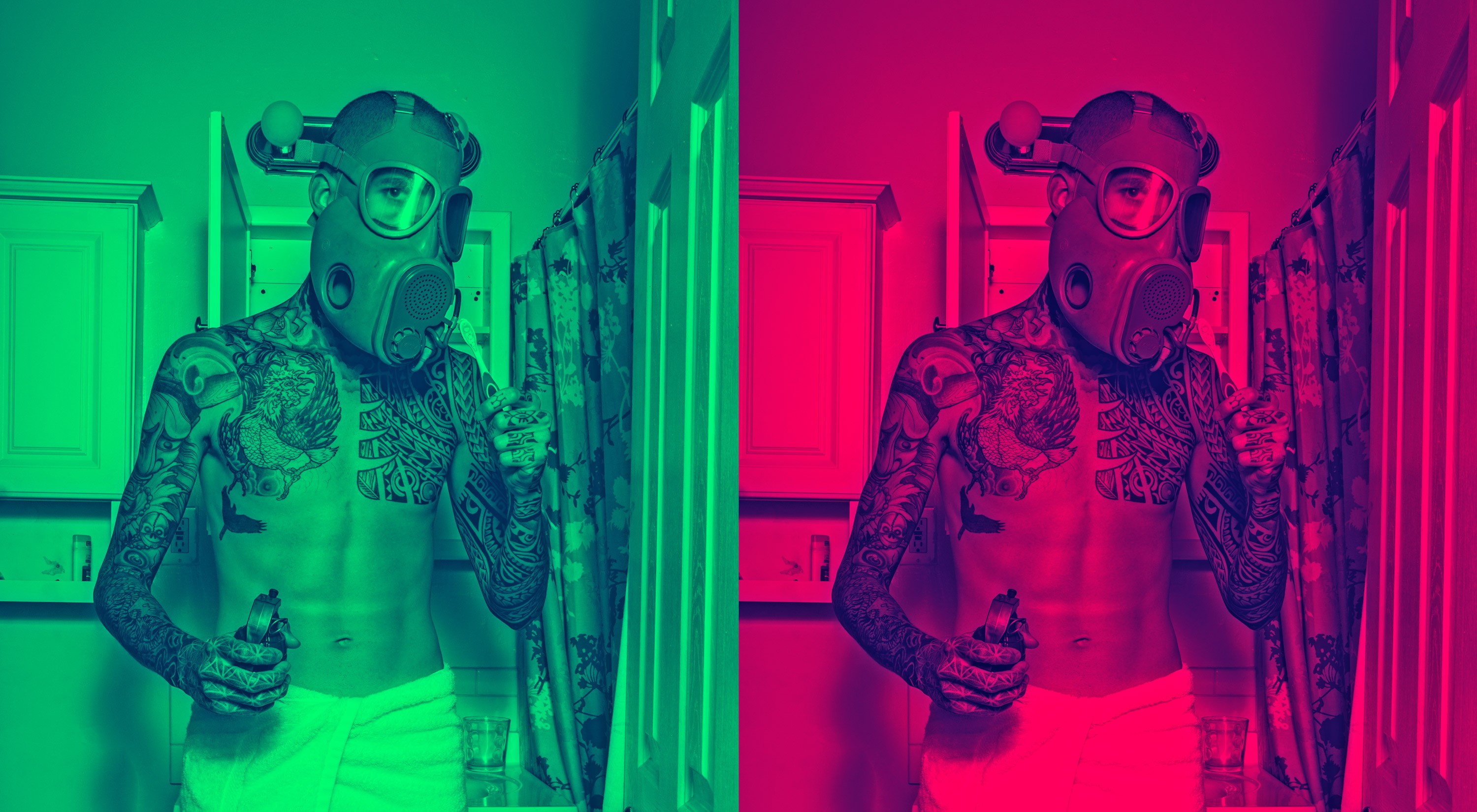
Before / After:
1- Gradient Map Adjustment Layer
There’s only one step to accomplish the effect really, and it’s about using a Gradient Map adjustment. What a gradient map does is map each level of luminosity in your image to a color. Dark tones get colored with one end of the gradient, bright tones get colored with the other end, and the tones in the middle get colored with where they fall in the middle of the gradient.
Here the breakdown of the steps:
- Add a new Gradient Map adjustment layer to your image.
- Choose one of the available gradients, or create your own by selecting any one and then changing the two color stops to something that works for your image.
- You can also tweak the placement of the mid point of the gradient (the little diamond) or move the color stops inwards to control exactly how the gradient gets applied and how much contrast you want in your final image.

Bonus tip: you can add more than 2 color stops to your gradient to create effects that are even more defined. For example, you could have two different colors in your highlights, with one that applies to the very brightest highlights.
Color Selection
Honestly, this technique is very easy, but you’ll probably find yourself spending quite a bit of time in the color selection phase.
The trick is to choose colors that go well together. One way to help with that is to go for complementary colors. Or you could use a dark version of a color in the shadows and a bright version of the same color in the highlights.
Most of the time it’s a good idea to keep the darker colors for the shadows, otherwise the result can look really funky and give you an inverted image effect. Choosing very bright and saturated colors in the highlights tends to work really well.
A Little Bit Subtler Please!
So the full effect can be quite nice, but sometimes it’s just too much, and you’d rather have a gentler effect and still see some of the original colors from your image. That’s an easy fix, just reduce the opacity of the gradient map layer, or change the blend mode of the gradient layer to something like Color or Luminosity.
Controlling Underlining Luminosity
Here’s an extra tip for you: if you add a Black & White adjustment layer underneath the gradient map, you’ll then be able to tweak the luminosity level of the different colors in the image. This way you can tweak the contrast from specific areas of your image depending on the color.
That’s what I did with the image in this post to darken down the luminosity of the reds and yellows a little and arrive at the final result:

🌄 Image info:
- Camera: Nikon D300s
- Focal length: 33mm
- Shutter speed: 1/10s
- Aperture: f/14
- ISO: 200